It is often said that visuals in games aren't nearly as important as the gameplay. We absolutely believe this to be true; however, when making a game where the story is the gameplay, those visuals suddenly rise in importance.
The saying that a picture is worth a thousand words is just as a true in a narrative game as it is in any other medium. In order to successfully craft a visual story, you must start with a solid plan. That doesn't mean you have to stick to it, but having an idea of where you are going is vital to getting somewhere worth going.
With story being so important in Arctic Awakening, we decided to make careful use of colors to support the emotional beats as well as to differentiate between areas of the game world, times of day and states of weather. This reliance on color lends itself to a stylized look; however, we didn't feel that an overly cartoony, low-poly or pixellated approach would sufficiently match the tone and scale of the story we wanted to tell. The ultimate goal is to transport the player to a place where they feel what the characters feel – the extremes of the environment, the mystery of the strange structures and the awe of jaw-dropping vistas.
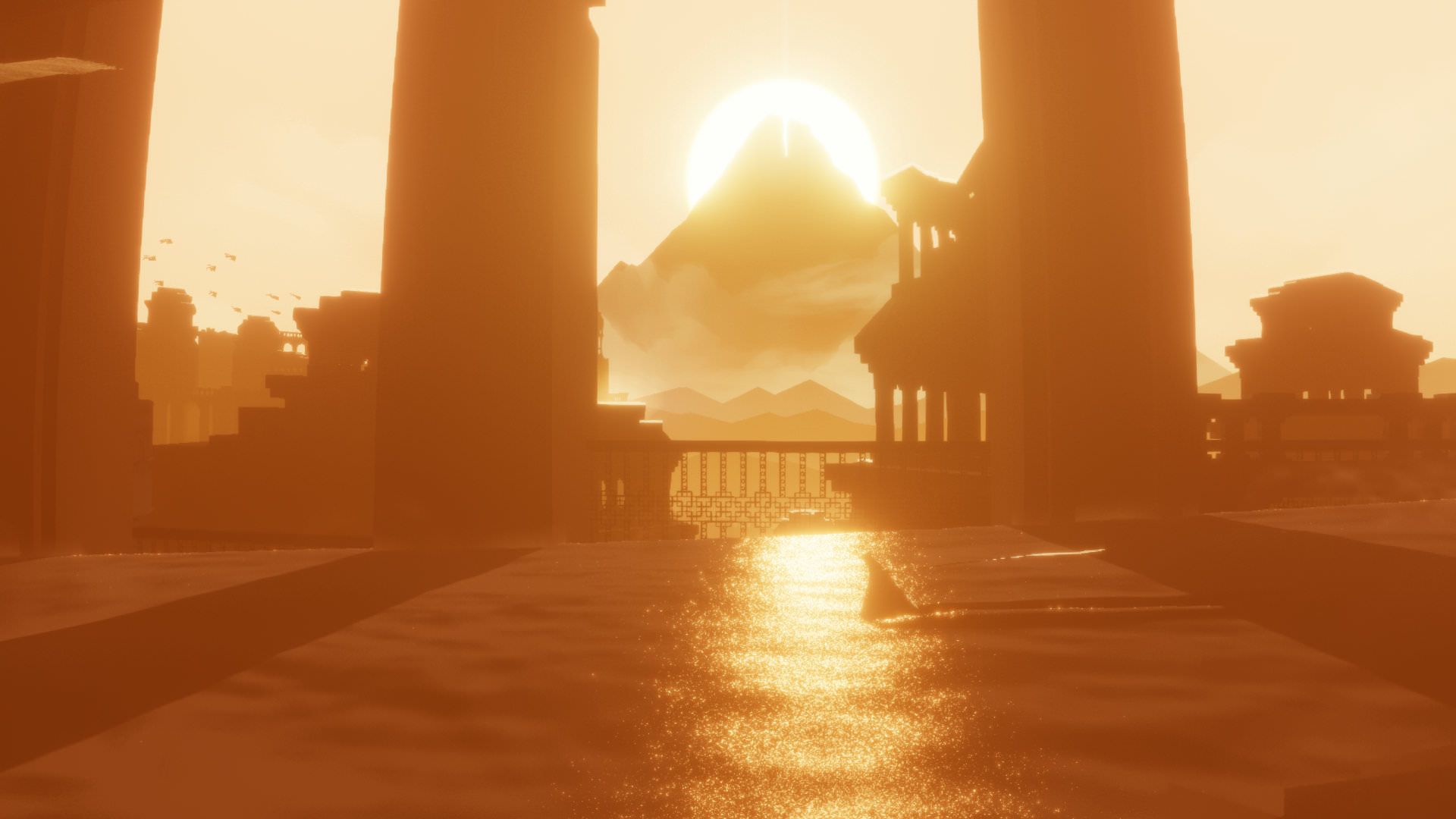
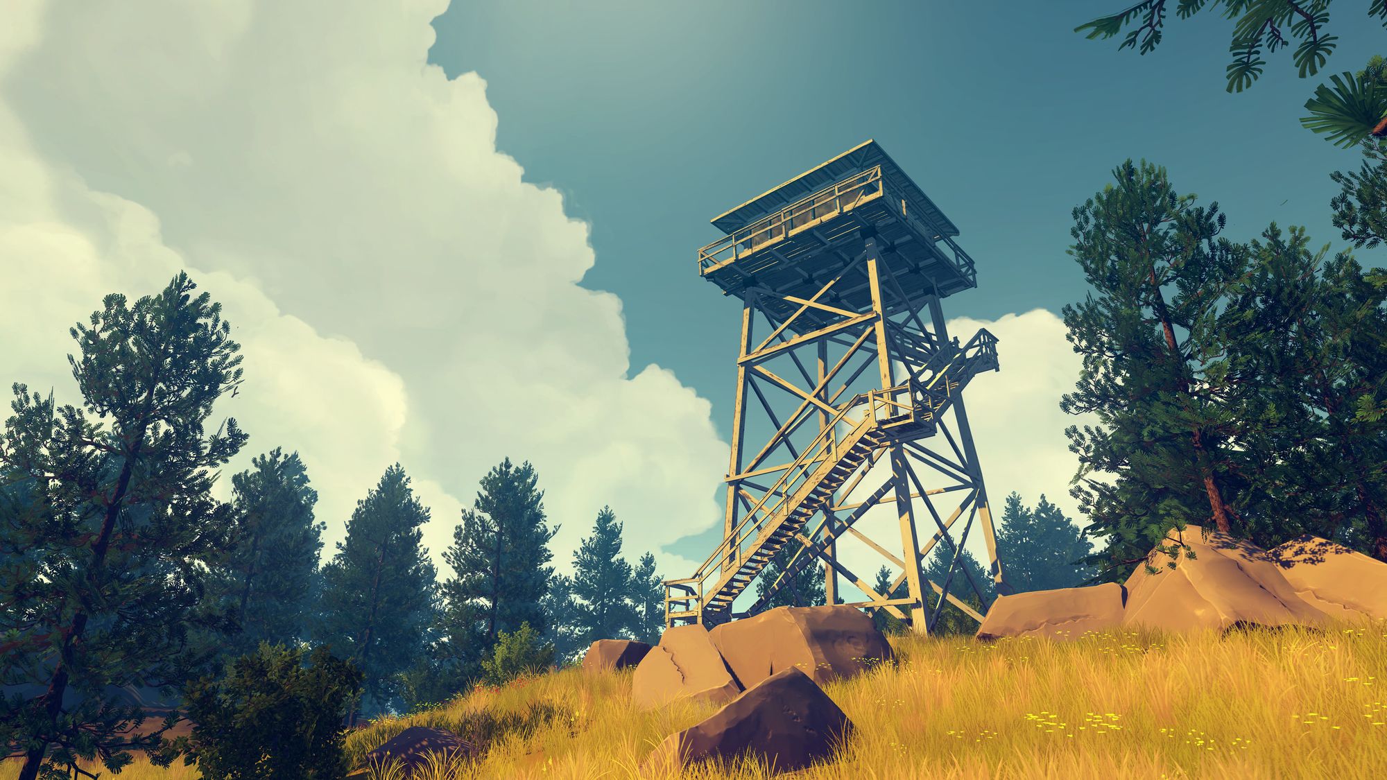
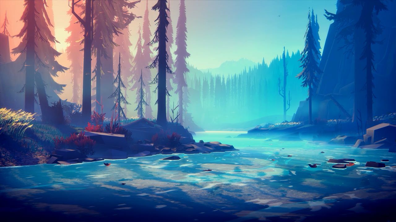
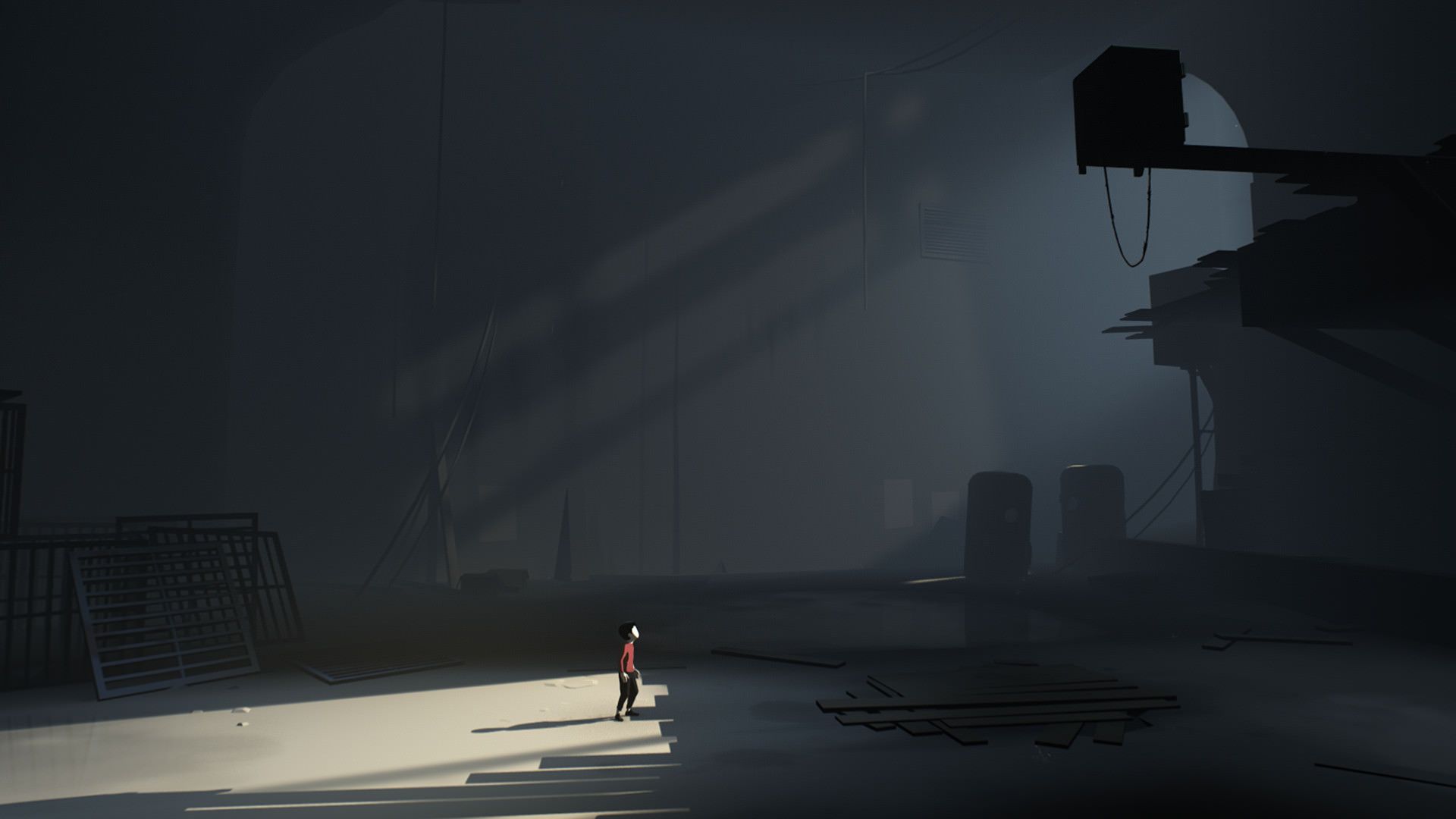
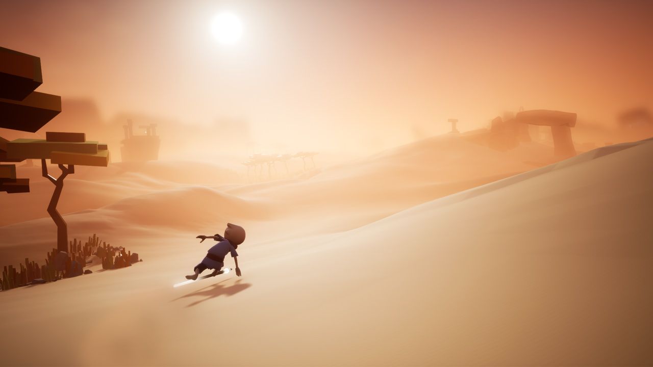
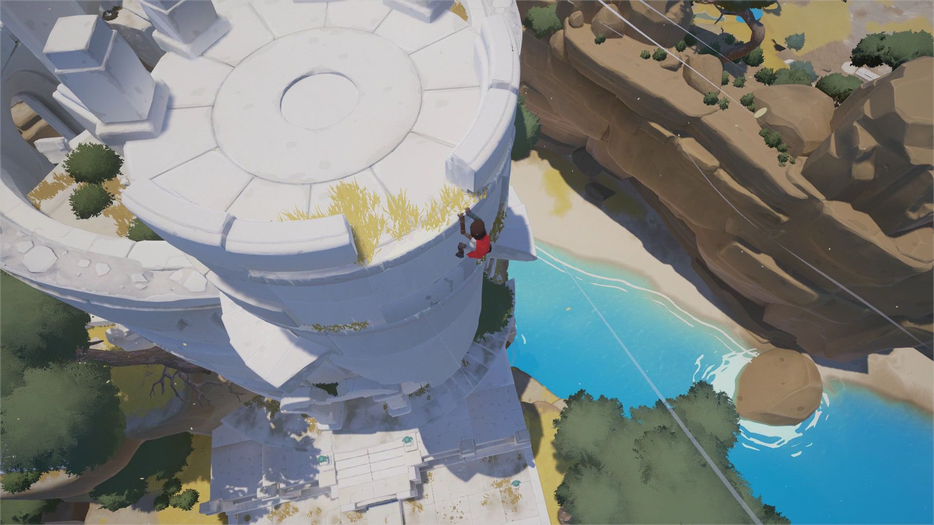
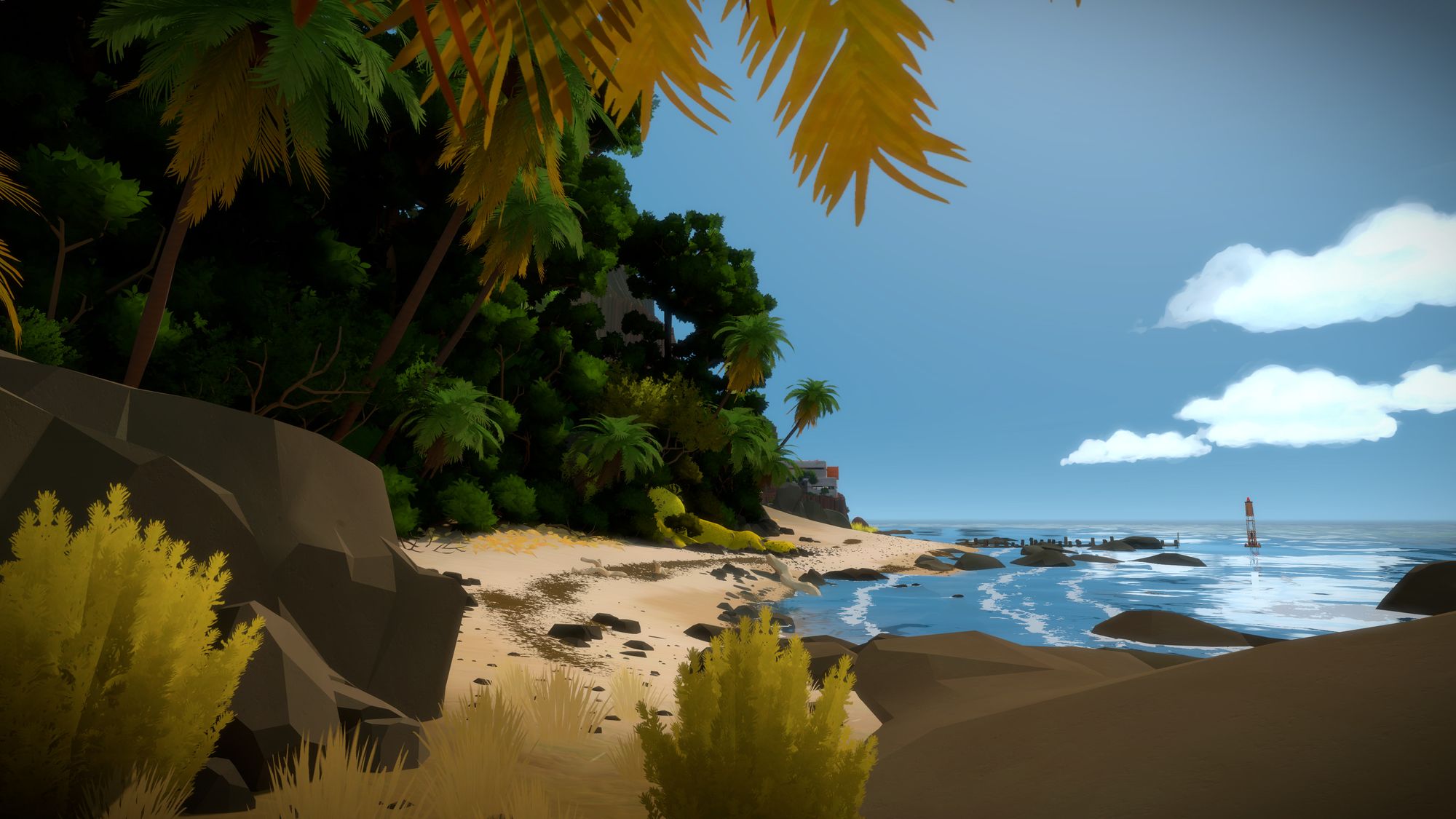
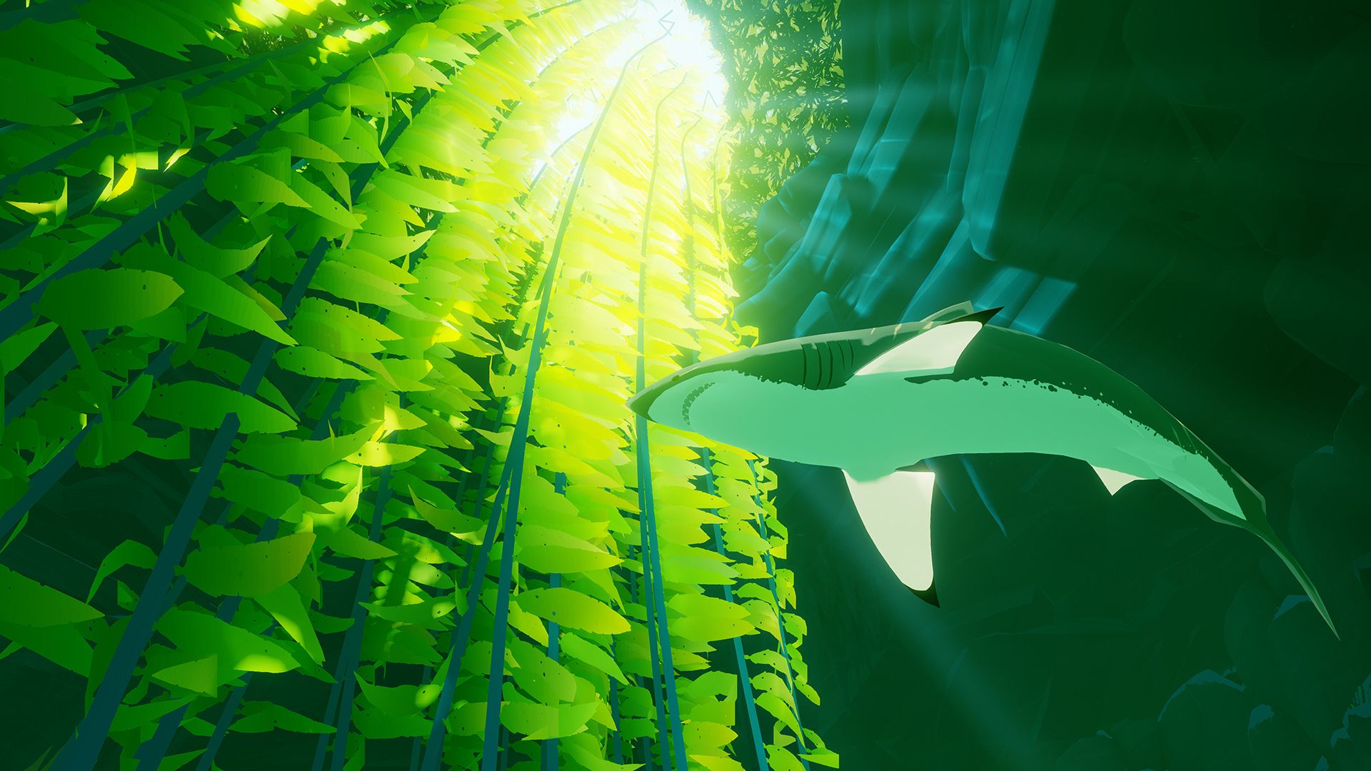
We needed to find somewhere in the middle, and incidentally, many of our favorite indie games fit somewhere in this same spectrum. No art is created in a vacuum. You are always absorbing the media you consume, especially the ones you enjoy most. These and many other games inspired the art style, but they never defined it. We wanted to find our niche and break out of it with our own unique style. However, we needed a starting point, and the below images from other indie games helped us to get the ball rolling.